

Your logo is often the first thing a customer sees, and the last thing they remember. A good logo builds trust in seconds; a bad one quietly tells people your business is careless, confusing, or out of date. Logo design mistakes are expensive because they are so visible: they sit on your website, your packaging, your social profiles, and every invoice you send. The good news is that most logo design mistakes are easy to avoid once you know what they are. This guide covers the most common errors small businesses make, and how to get a logo that actually works for you.
Mistake 1: Trying to Say Everything at Once
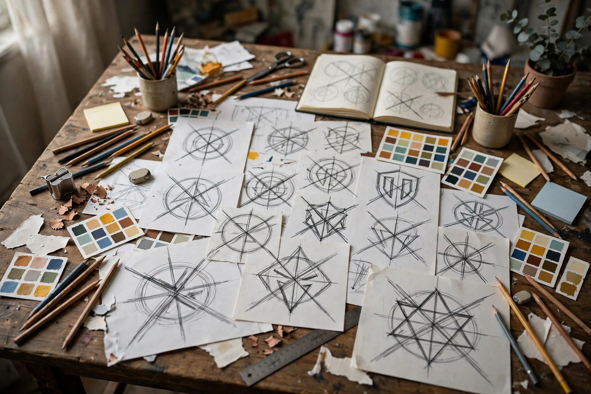
The most common logo design mistake is cramming in too much: a symbol, a slogan, three colors, a mascot, and a tagline, all fighting for attention in a tiny space. A logo is not an advertisement and it is not a brochure. Its job is to identify your business in a glance, not to explain everything you do. Think of the logos you recognize instantly. They are almost always simple: one idea, executed cleanly. A coffee shop does not need a cup, a bean, a mountain, and a sunrise in its logo. It needs one strong image that people can remember and reproduce.
Simplicity also survives real-world use. Your logo will appear as a tiny profile picture, a favicon in a browser tab, embroidered on a shirt, and printed in one color on a receipt. A complicated logo turns into an unreadable smudge at small sizes, while a simple one stays clear everywhere. When reviewing a design, shrink it to the size of a postage stamp. If you cannot read it or recognize it at that size, it is too complex.
Mistake 2: Following Trends Instead of Your Customers
Design trends change every year: ultra-thin lettering one year, retro badges the next, gradients after that. A logo built on a trend looks dated fast, and rebranding every few years confuses customers and costs money. Worse, trend-chasing often produces a logo that looks like everyone else in your industry, because every competitor read the same trend article. Your logo should reflect your business and your customers, not the current fashion in design blogs.
That said, a logo should not look frozen in the past either. The test is timelessness: would this logo still look sensible in ten years? Classic principles last: clear shapes, readable type, and colors that suit your industry and audience. A children’s play center can be bright and playful; a financial advisor should look steady and calm. Match the design to the feeling your customers need to have, and the logo will age gracefully.
Mistake 3: Choosing Fonts and Colors Carelessly
Fonts carry meaning. A script font feels personal and elegant, but becomes unreadable in small sizes and looks wrong for a construction company. A heavy industrial font feels strong, but looks cold for a bakery. Many logo design mistakes come down to a font that fights the business it represents. Choose one main font for your logo, make sure it is readable at every size, and check that it renders correctly on the web, where unusual fonts may be replaced by something entirely different.
Color deserves the same care. Colors trigger feelings before words are even read: blue suggests trust, green suggests growth or nature, red suggests energy or urgency. Pick two or three colors at most, and test the logo in black and white. If it falls apart without color, the design is too dependent on color alone. Also consider where the logo will appear: a pale yellow logo may look beautiful on a dark website but vanish entirely on white packaging.
Mistake 4: Copying Competitors, Even Accidentally
It is natural to look at competitors for inspiration, but a logo that looks like a rival’s creates two problems. Legally, you risk a trademark dispute that a small business can ill afford. Commercially, you confuse customers, who may credit your good work to a competitor, or blame you for a competitor’s bad work. Before finalizing a design, search your industry and your local area for similar marks. A quick image search and a trademark database check can save an expensive redesign later.
Originality does not require something wild. It requires a design that comes from your own business: your name, your story, your location, or the specific thing you do differently. A family bakery that has used the same oven for forty years has a story no competitor can copy, and that story can inspire a genuinely unique mark. For fresh thinking on standing out visually, browse the design inspiration guides on this site.
Mistake 5: Skipping the Real-World Tests
Many logos look great on a designer’s screen and fail everywhere else. Before you commit, test your logo in the places it will actually live. Print it in black and white. Put it on a dark background and a light one. Shrink it to a social media avatar. Stretch it across a wide banner. Ask people who have never seen it what business they think it represents, and what feeling it gives them. If their answers surprise you, the logo is communicating something you did not intend.
Also get the right files. A proper logo package includes vector files that scale without losing quality, plus high-resolution images with transparent backgrounds for web and print. A single low-resolution image file, however pretty, will cause problems the first time you need a sign, a vehicle wrap, or a large banner. If a designer cannot supply these formats, that is a warning sign in itself. Good visuals matter beyond the logo too: our content creation tips explain how consistent imagery across your posts strengthens everything your logo starts.
Mistake 6: Designing for Yourself Instead of Your Customers
Founders often choose a logo they personally love, even when it confuses their customers. Your taste matters, but your customers’ reaction matters more. A logo for a children’s toy shop should delight parents and children, not impress other designers. A logo for a plumbing business should reassure a homeowner in an emergency, not win an art award. Show your shortlisted designs to a handful of real customers and listen to what they say. If several people misread your business from the logo, believe them, not your own attachment to the design.
This is also why feedback from friends and family can mislead: they are polite, and they already know what your business does. Strangers give you the truth, because they judge the logo exactly the way a new customer would. A short, honest test with ten strangers will teach you more than weeks of debate among people who already love your business.
Conclusion
Logo design mistakes are almost always avoidable: keep it simple, ignore passing trends, choose fonts and colors with intent, stay original, test the logo everywhere it will appear, and design for your customers rather than yourself. A logo does not need to be clever or expensive to be effective. It needs to be clear, memorable, and true to your business. Fix these six mistakes, and your logo will do the quiet, constant work every good brand mark should: making your business easy to recognize, easy to trust, and easy to remember. For more branding guidance, visit the Brandzyro homepage and explore the latest guides.