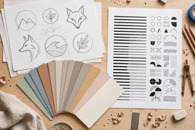

Every successful business is built on more than a good product. Customers choose brands they recognize, understand, and trust, and that recognition starts with brand identity design. Your identity is the complete visual and verbal system that tells people who you are, what you stand for, and why you are different from the business next door. When it is done well, a single color, shape, or sentence can bring your whole business to mind. When it is neglected, even excellent products get overlooked because the business behind them looks forgettable or inconsistent.
What Brand Identity Design Actually Includes
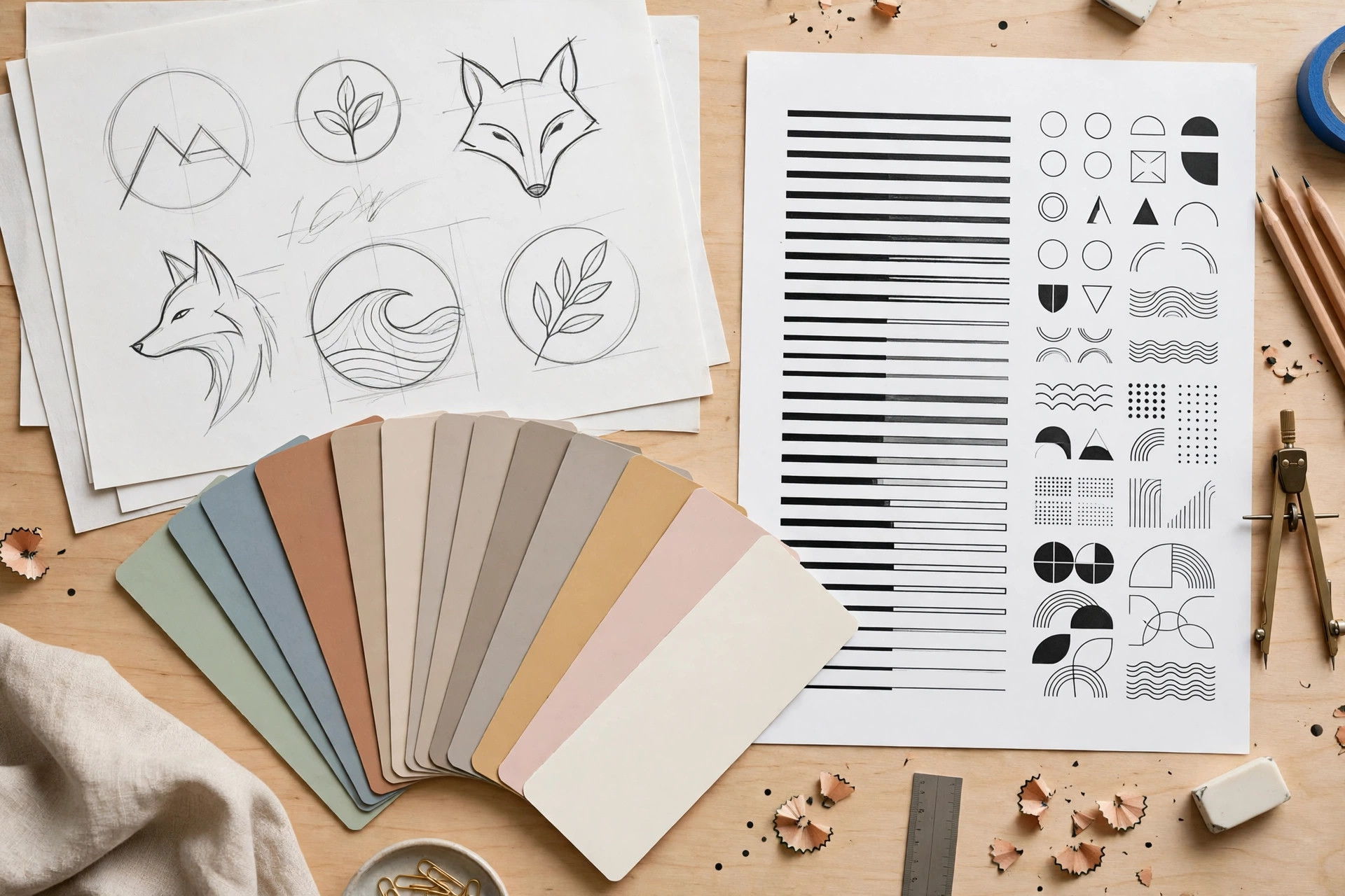
Many beginners confuse a logo with a full identity, but a logo is only one piece of the puzzle. A complete identity system gives you consistent building blocks that work together everywhere your business appears, from your website header to your packaging and invoices.
The Core Visual Elements
- Logo: a simple, memorable mark that works at any size, from a browser tab icon to a shop sign.
- Color palette: two or three main colors plus supporting neutrals, chosen to match the feelings you want customers to have.
- Typography: one headline font and one body font that stay the same across your website, ads, and documents.
- Imagery style: the type of photos, illustrations, and icons you use, so every post and page feels like it comes from the same business.
The Verbal Elements
Identity is also about words. Your brand voice decides whether you sound friendly, expert, playful, or premium. Pair that voice with a clear tagline and a short brand story, and customers start to feel they know you. Businesses that plan their messaging early find everything else easier, which is why our content marketing basics guide is a useful companion read before you start publishing under your new identity.
Step 1: Define What Your Brand Stands For
Good brand identity design starts long before anyone opens design software. You first need honest answers to a few foundational questions. Who exactly are you serving? What problem do you solve better than anyone else? What three words should customers use to describe you? Write these answers down, because every design decision later should be checked against them. A law firm and a skate shop can both want to look “professional,” but the colors, fonts, and photos that express professionalism for each are completely different.
Research Your Audience and Competitors
Look at the brands your ideal customers already buy from and note what those businesses have in common. Then study your direct competitors and find the gap: the color nobody uses, the tone nobody speaks in, the promise nobody makes. Your identity should fit your market enough to be understood, but stand apart enough to be remembered. This balance between familiar and distinctive is the heart of strong branding.
Step 2: Design the Visual Identity
With your strategy clear, you can brief a designer or use modern design tools with confidence. Start with the logo, keeping it simple enough to remain readable on a phone screen. Avoid trendy effects that will look dated within a year; the best identities feel current for a decade. Next, lock in your color palette. Colors carry emotion: blue suggests trust, green suggests freshness and growth, orange feels energetic and affordable, and black signals premium quality. Choose based on your positioning, not personal taste alone.
Typography deserves the same care. A bold geometric headline font gives a modern tech feel, while a classic serif suggests heritage and reliability. Whatever you choose, document it. A simple one-page brand style guide covering logo usage, colors with their codes, fonts, and photo style will save you endless inconsistency later, especially as your team grows and more people create content on your behalf.
Step 3: Apply the Identity Everywhere
An identity only works when customers see it applied consistently. Audit every touchpoint: your website, social profiles, email signature, packaging, invoices, presentations, and physical signage. Replace old logos and mismatched colors, and update profile photos and banners so a customer moving from your Instagram to your website feels they are still in the same place. Consistency is also why planning content matters; following a structured approach like the one in this social media content plan guide keeps your visuals and voice aligned week after week.
Common Mistakes That Weaken an Identity
- Using too many colors and fonts, so nothing stands out.
- Copying a famous brand so closely that customers confuse the two.
- Redesigning every few months, which destroys recognition just as it starts to build.
- Designing for personal taste instead of the target customer’s expectations.
Step 4: Keep the Identity Alive and Consistent
Launching your identity is the beginning, not the end. Create a shared folder with final logo files, your style guide, and approved templates for social posts, quotes, and presentations. When you publish educational content, plan it around your positioning; the method described in this beginner’s content strategy guide shows how consistent topics reinforce what your brand stands for. Review your touchpoints every six months, because small drifts, a different shade here, an off-brand photo there, quietly add up.
Strong brand identity design also makes marketing cheaper. Ads get recognized faster, content looks instantly familiar, and referrals carry more weight because people can describe and remember you. Over time, that recognition compounds into trust, and trust is what turns first-time buyers into loyal customers who choose you without comparing prices.
How to Know Your Identity Is Working
A finished identity should make everyday marketing noticeably easier, and there are simple signs to watch for. Customers begin describing your business in the words you chose for it. Your social posts get recognized before people even read the account name. New team members can produce on-brand materials from your style guide without asking for help on every detail. Design decisions that once took a week of debate now take an afternoon, because the guide answers most questions in advance.
You can also test recognition directly. Show a regular customer your new packaging, advertisement, or homepage without the logo visible and ask whose it is. If they answer correctly and their description matches your positioning, your brand identity design is doing its job. If they hesitate or guess a competitor, the system needs tightening, usually in the form of fewer elements used more boldly. Treat identity as a long-term asset that you refine with evidence, not a one-time project you finish and forget.
Conclusion
Brand identity design is not decoration; it is the visible promise of your business. Define what you stand for, build a simple system of logo, colors, fonts, imagery, and voice, apply it everywhere without exception, and protect it with a clear style guide. Do that consistently, and your business will stop blending into the crowd and start being the name customers remember first.