
People judge a business in seconds, long before they read a single review or compare prices. The quickest way to pass that first impression test is to explore visual branding ideas that make everything you publish look intentional and polished. You do not need a huge design budget or an in-house studio. You need a small set of consistent choices, applied everywhere, plus a few smart upgrades to the places customers look at most: your logo, your website, and your social profiles.
Start With a Simple, Consistent Color System
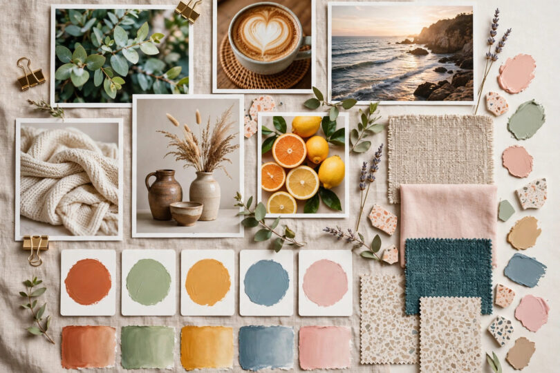
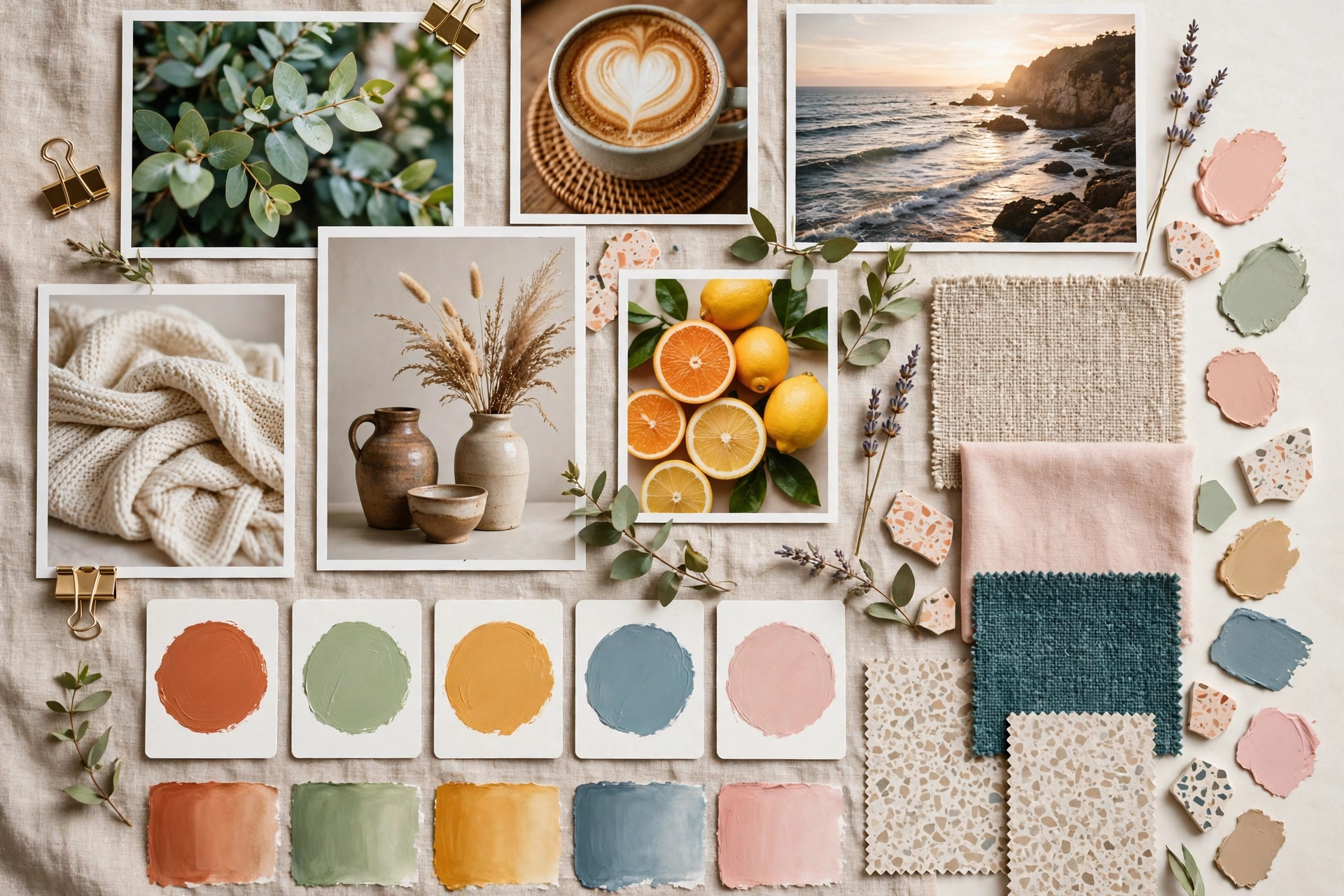
Color is the fastest branding signal of all. Choose one primary color that represents your personality, one supporting color for highlights and buttons, and a neutral set of grays or creams for backgrounds and text. Then stop. Brands look amateur when every post uses a different shade grabbed at random, and they look professional when the same palette appears on the website, the packaging, the email header, and the shopfront. If you already have brand colors, audit your recent posts honestly: how many different blues have crept in over the last three months?
Let Color Do the Talking
Use your primary color sparingly for the things you most want noticed: your logo, your call-to-action buttons, your headlines. When everything is highlighted, nothing is. Contrast matters too; text must remain easy to read on every background you use, on phones in bright sunlight as well as on desktop screens.
Upgrade Your Typography and Layout
Fonts quietly shape how trustworthy a business feels. Limit yourself to two: one distinctive font for headlines and one clean, highly readable font for body text. Apply the same pairing in your documents, website, and graphics. Layout is the other half of polish. Generous white space, aligned elements, and consistent spacing between sections make even simple designs look premium, while crowded pages with clashing elements make expensive products look cheap. The practical presentation techniques in these content creation tips for better engagement show how cleaner visuals directly lift how long people stay and interact.
Make Your Photography Look Like One Brand
Mismatched photos are the most common giveaway of DIY branding. Fix this without a photographer by choosing one photographic style and sticking to it: bright and airy, dark and moody, or warm and natural. Use the same filter or editing preset on every image, shoot products against similar backgrounds, and prefer real photos of your team, workspace, and customers over generic stock images whenever possible. Consistency here is one of the highest-impact visual branding ideas because customers scroll fast, and a recognizable photo style makes them stop on your posts without even seeing your name.
Create Templates Once, Use Them Forever
Design five or six reusable templates: a quote graphic, a product announcement, a testimonial card, a sale promotion, a blog cover, and a video thumbnail style. Build them in any beginner-friendly design tool using your locked colors and fonts. Templates remove daily design decisions, keep every post on-brand, and let anyone on your team produce polished graphics in minutes. Planning those posts ahead with a structured approach like the one in this social media content plan guide keeps the templates flowing in a balanced mix rather than a stream of promotions.
Polish the Places Customers Check First
- Profile photos and banners: use the same logo version and banner style on every platform.
- Website hero section: one clear headline, one strong image, one obvious button, all in brand colors.
- Email and invoices: a branded header and signature make routine messages feel professional.
- Packaging and print: even a simple branded sticker or thank-you card elevates the unboxing moment.
None of these upgrades requires a rebrand. Each one simply removes the small inconsistencies that make customers subconsciously hesitate. Businesses often discover that after tightening their visuals, the same products and prices suddenly convert better, because the presentation finally matches the quality of what is being sold. If you are tightening your written content at the same time, the foundations in this content marketing basics guide pair naturally with a visual refresh.
A One-Week Visual Branding Makeover Plan
If a full overhaul feels overwhelming, spread the work across a single week of short, focused sessions. Small daily wins build momentum and keep the project from stalling.
- Day 1: screenshot your website, profiles, and recent posts, and list every inconsistency you can spot.
- Day 2: lock your color palette and two fonts, and write them down with their exact codes.
- Day 3: update your logo files and profile photos everywhere, including the favicon on your website.
- Day 4: build your five or six reusable templates using the locked palette and fonts.
- Day 5: refresh your website hero section and your three most visited pages with the new system.
- Day 6: choose one photo style, apply a consistent edit to your key images, and replace the worst mismatches.
- Day 7: save everything, the palette, fonts, templates, and logo files, in one shared brand folder your whole team can find.
By the end of the week you will have applied the highest-value visual branding ideas without pausing your business for a lengthy rebrand project. The final step is maintenance discipline: before publishing anything new, hold it against the brand folder for ten seconds. Does it use the right colors, the right fonts, and the right photo style? That tiny pause, repeated daily, is what keeps a business looking professional month after month while competitors slowly drift back into visual chaos. Remember that customers rarely compliment consistency directly; they simply feel that your business is established, careful, and worth paying. That feeling is the real return on every hour you invest in presentation.
Conclusion
The best visual branding ideas are simple ones executed relentlessly: a locked color palette, two fonts, one photo style, reusable templates, and polished key touchpoints. Pick the weakest area of your current presentation, fix it this week, and move to the next. Within a month your business will look bigger, calmer, and more trustworthy, and customers will feel the difference before they can explain it.